
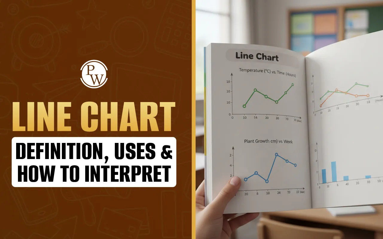
Line Chart – Definition, Uses & How to Interpret

A line chart is a fundamental data visualization tool that displays information as a series of data points, called markers, connected by straight line segments. Primarily used to track changes over short and long periods, it effectively illustrates trends, patterns, and fluctuations in data. By plotting variables on a two-dimensional grid, it provides a clear visual narrative of how a specific value evolves over time or across different categories.
Exploring the Line Chart Example, Tools, and Creation Methods
When you are looking for a line chart example, you usually find them in places where "change" is the main story. Think about a company’s stock price over a week or even your own heart rate during a workout. Because the markers are connected by lines, your eyes can instantly follow the upward or downward movement. This makes a chart far superior to a simple table of numbers when you need to spot a trend in a split second.
In a professional or school setting, you definitely don’t want to be drawing these by hand with a ruler if you can help it. Most people rely on a line chart excel setup. It’s pretty simple: you highlight your columns of data, hit "Insert," and the software does the heavy lifting. The beauty of using a spreadsheet is that you can tweak the colors, labels, and scales until the data actually makes sense to whoever is looking at it.
If you don't have a spreadsheet program handy, using a web-based line chart maker or a line chart generator is a great shortcut. These tools are built for speed. You just plug in your "x" values (like dates or months) and your "y" values (the actual numbers or measurements), and it spits out a clean, professional image. Whether you’re using a high-end platform like Tableau or a simple free generator, the goal is always the same: turning a pile of confusing numbers into a clear, visual story.
How to Interpret and Construct a Line Chart Effectively
To really get the most out of a line chart, you have to know more than just how to look at it; you need to understand the "logic" of the lines. Building a chart and reading a chart are really two sides of the same coin. If it’s built right, the interpretation feels like common sense.
The Anatomy of a Good Line Chart
According to standard data visualization practices, every solid chart needs a few basic parts to be useful:
-
The X-Axis: This is the horizontal line at the bottom. It usually represents time—like days, months, or years—but it can represent any continuous measurement.
-
The Y-Axis: This is the vertical line on the side. This is where you put your quantity, like money, temperature, or a score.
-
The Markers: These are the little dots where the x and y values meet. They represent the actual "facts" in your data.
-
The Plot Area: This is the "stage" where the lines and dots live.
-
The Legend: If you’re comparing two or three different things at once (called a multi-line chart), the legend tells you which color belongs to which group.
A Simple Guide to Building One
If you’re not using an automated line chart generator and are setting one up yourself, here is a reliable workflow:
-
Organize Your Data: Make sure your data is in a clean table with two columns.
-
Set Your Scale: Draw your axes. Make sure your intervals are even. If you go from 10 to 20 on the y-axis, the space should be the same as the jump from 20 to 30.
-
Plot the Points: Carefully place your markers at the correct intersections.
-
Connect the Dots: Draw straight lines between the points, moving from left to right.
-
Add Context: A chart without a title or labels is just a zigzag. Always label your axes so the viewer knows what 10 or 20 actually represents.
How to Read the Story
When you analyze a line chart, you're usually looking for three big indicators:
-
The General Trend: Is the line mostly going up or mostly going down? This tells you the "big picture."
-
Spikes and Dips: Sudden jumps or drops usually mean something important happened at that specific time. These "outliers" often explain the most interesting parts of a project.
-
Cross-over Points: In charts with multiple lines, the spot where lines cross is the exact moment when two different things were equal.
Read More - Linear Functions - Definition, Equation, Graph, Examples
Why Use a Line Chart? Practical Uses and Best Practices
The line chart is a favorite for a reason. Unlike pie charts, which only show "slices" of a whole, or bar charts, which compare separate buckets of data, the line chart is the king of continuity. It shows how things are connected.
Real-World Uses
-
Finance: Monitoring a budget or watching a stock's performance.
-
Science: Tracking how a temperature changes during a chemical reaction.
-
Marketing: Seeing if website traffic is growing week-over-week.
-
Weather: Viewing the high and low temperatures across an entire month.
Read More - Cartesian Plane - Definition, Quadrants, Examples
Tips for Keeping it Clean
Even though a line chart maker makes the process fast, it’s still up to the human to make it readable.
-
Don't Overdo It: If you put ten different lines on one chart, it looks like a bowl of colorful spaghetti. Try to limit yourself to four or five lines.
-
Check Your Y-Axis: Sometimes people start the y-axis at a high number to make small changes look huge. For an honest look, it’s usually best to start at zero.
-
Use Contrast: If you’re comparing "Last Year" to "This Year," use two very different colors so people don't have to squint to see the difference.
Make Mental Maths Simple, Fun, and Stress-Free with CuriousJr
Does your child feel unsure or lose focus while solving maths problems? Many children find maths challenging and feel anxious. With the right support and teaching methods, maths can become easy, enjoyable, and confidence-building.
CuriousJr’s online mental maths classes are designed to create a positive learning experience. These interactive sessions follow the school syllabus and explain concepts clearly in a practical way. Children improve speed, accuracy, and understanding while developing a strong interest in maths.