
Real Life Data Interpretation Made Easy (Class 8)
 Nikita Aggarwal29 May, 2026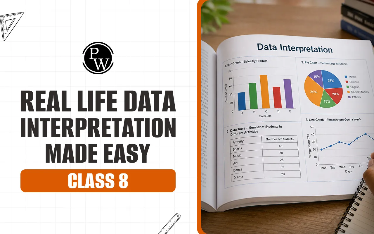
Importance of Data Interpretation Skills
Data interpretation is not a chapter in a book that you need to clear school exams. It is a vital core competency used across various fields . It is the baseline of real world maths . You can see these skills at work in how a business keeps track of its monthly sales, how scientists keep track of climate changes, or how sports analysts study player performance.
Learning these skills early helps you process visual information quickly. Instead of just staring at a page of numbers, you learn to see immediate trends, to find maximum or minimum values, and to make logical predictions. This is a very important part of mental maths training and it trains your brain to calculate the numerical relationships quickly without relying heavily on rough paperwork.
Real Life Data Interpretation Tricks to Understand Graphs
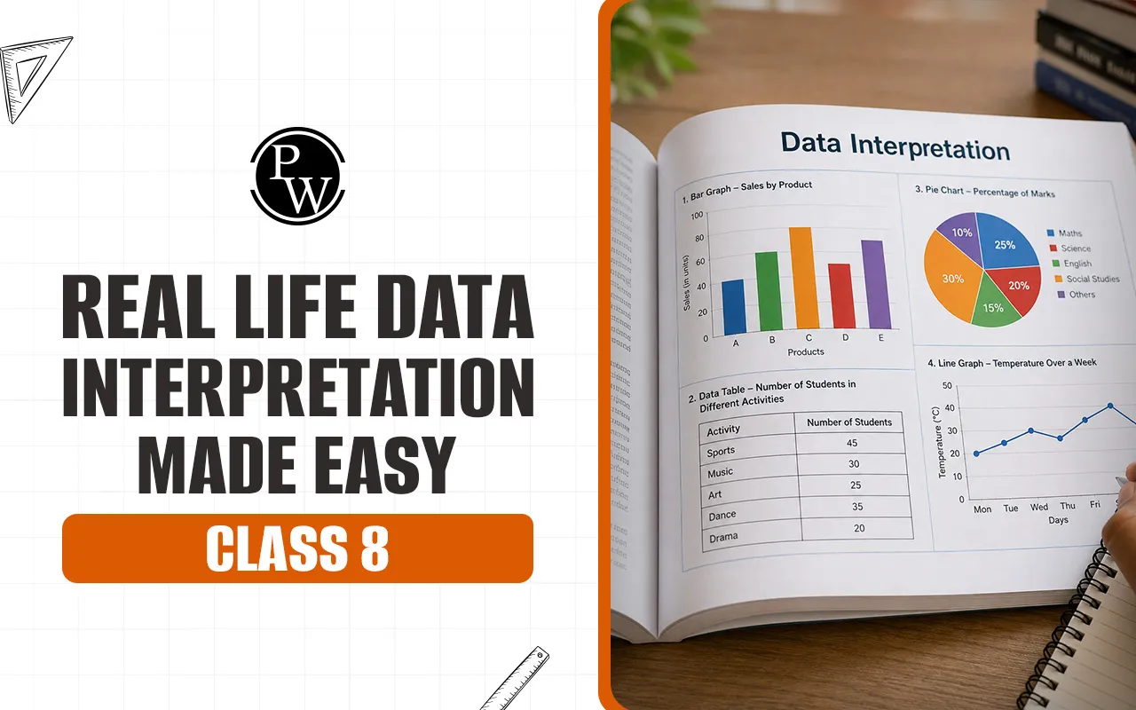
To use advanced shortcuts, you first need to have a solid understanding of the basic visual tools in the basics of statistics. The most common visual representation you will find in Class 8 is the circle graph or pie chart.
Pie Chart ( Circle Graph )
A pie chart is a circular statistical graphic, which is divided into slices to illustrate numerical proportion. A circle graph uses the whole area of the circle to represent the entire data set, or 100 percent of the total values. Each individual slice is a specific component or part of that total data.
Circle Graphs: Key Features
The complete circle is 100% of the total value.
If you add up all the angles of the internal components around that central point, you will always get 360 degrees.
The size of each slice is proportional to the amount it represents.
Real Life Data Interpretation Tricks with Important Formulas
Here is a quick way to solve circle graph problems: you need to know how to change from percentage to fraction to angle. All graphs charts practice is based on the following three basic maths formulas:
1. Determining the Angle of the Component Center
If you want to draw a pie chart, or get an angular value of a particular slice from raw data, use this clear calculation step:
Central Angle = (Component Value / Total of all component values) * 360 degrees
2. Finding the Percentage of a Part
If you have the central angle and want to find out its percentage value of the whole circle, use this formula layout:
Value in Percentage = Central Angle / 360 * 100
3. Determining the Component Value from the Central Angle
If the question gives you the central angle and the total and asks you to find the actual number for that particular category, this is what you do:
Component Value = (Central Angle/360) * Total Value
Read More - Ranking and Ordering Mental Maths Tricks for Class 8
Few Real Life Data Interpretation Tricks
When you’re in an exam hall, you don’t have time to do long multi-step long divisions for each question. Use these quick real life data interpretation tricks to get answers fast.
1. Degree to Percentage Conversion Method
Instead of calculating the entire formula each time, memorise key angular milestones and solve questions in your head. 360 degrees = 100% So you can use these quick reference points:
Half of 180 degrees (50%) is always the data.
A quarter of the data ( 25 % ) is always EXACTLY 90 degrees .
36 degrees is always exactly one tenth of the data (10 per cent).
18 degrees is always exactly (5 per cent).
If a question tells you to find the value of a slice with a 54 degree angle, don’t use the full formula. Just break down 54 into 36 degrees plus 18 degrees. So the slice is exactly 10% + 5% = 15% of the total value. This is an amazing shortcut for mental maths class 8.
2. Method for Simplifying Fractions
Reduce your component fraction to lowest terms before you multiply your numbers out. Smaller fractions are easier to work with and avoid careless multiplication errors.
For example if your component value is 60 out of 240 simplify the fraction first :
60/240 reduces to 1/4.
Finding 1/4 of 360 degrees is a lot faster than multiplying 60 by 360 and dividing by 240.
3. The visual deletion trick
Always look carefully at the proportions in the diagram before looking at the answer choices in a multiple-choice question.
If a slice seems to be smaller than a right angle , then its central angle is less than 90 degrees .
If a slice looks just like a straight line through the middle, it has to be 180 degrees or 50%.
These visual cues make it easy to quickly rule out wrong answer options.
4. Method of mapping ratios
If the question asks you to compare two different categories within the same pie chart, do not compute the individual raw numerical values of the two categories. Rather compare their angles or percentages directly.
Category A has an angle of 80 degrees, Category B has an angle of 40 degrees, Category A is exactly twice the value of Category B.
That saves you the trouble of calculating the real numbers of both categories, and subtracting them.
5. The 1% and 10% Core Foundation Rule
To calculate particular percentages without a calculator, find 10% or 1% of the total amount.
To find 10% of any number, just move the decimal point one place to the left.
To find 1 move the decimal point two places to the left.
These are baseline units . You can scale these up or down easily to get any final value that you want .
Read More - Logical Deductions Mental Maths Tricks for Class 8
Real Life Data Interpretation Tricks with Solved Examples
Let us now see how to apply these specific real life data interpretation tricks to common practical problems.
Question 1: Computing Central Angles from Spending Data
Different household needs are met by a family out of its monthly income. They spend £4000 a month on food out of a total monthly income of £16000. Fig. 1. Population distribution by category. Calculate the central angle that this category would occupy on a circle graph.
Step 1 (Write the component value and the total value): Component = £4000 Total = £16,000
Step 2: For small numbers, simplify the relationship fraction right away: 4,000 / 16,000 = 1 / 4.
Step 3 : Now take this simplified fraction and multiply it by the total degrees in a circle . ( 1 / 4 ) * 360 degrees .
Step 4: Calculate the final value: 360 divided by 4 = 90 degrees.
Problem 2: Determining Real World Values from Given Angles
Question: The pie chart below shows the favourite sports of 720 students in a school. If the central angle for football is 60 degrees, find the exact number of students that prefer football.
Step 1. Recognise the given values. Total Value = 720 students Central Angle = 60 degrees
Step 2: Write the component formula: (60/360) * 720
Step 3: First reduce the degree fraction: 60 / 360 becomes 1 / 6.
Step 4 Work out last student number (1 / 6) * 720 = 120 students
Real Life Data Interpretation Tricks Quick Conversion Table
This handy lookup table will instantly convert common circle graph segments in your everyday graphs and charts practice.
|
Central Angle (Degrees) |
Simplified Fractional Value |
Equivalent Percentage (%) |
|
360 |
1 / 1 (Whole Circle) |
100% |
|
180 |
1 / 2 |
50% |
|
120 |
1 / 3 |
33.33% |
|
90 |
1 / 4 |
25% |
|
72 |
1 / 5 |
20% |
|
60 |
1 / 6 |
16.67% |
|
36 |
1 / 10 |
10% |
Learn Real Life Data Interpretation Tricks with CuriousJr
Understanding charts, graphs, and percentages becomes much easier when students practice through interactive activities instead of memorizing formulas. Many Class 8 students struggle with data interpretation because large numbers, percentages, and diagrams can feel confusing during exams.
This is where CuriousJr online mental maths kids class helps students strengthen their mental maths and logical reasoning skills through engaging learning methods. The platform focuses on quick calculations, pattern recognition, visual problem-solving, and real-world maths applications that make topics like graphs, pie charts, and statistics basics easier to understand. Through interactive practice sessions and structured mental maths exercises, students gradually improve their speed, confidence, and accuracy while solving real life data interpretation questions.




Real Life Data Interpretation Made Easy (Class 8) FAQs
Fastest real world data interpretation tricks for finding percentages from angles?
Why do we use circle graphs more than data tables in real world maths?
How can I improve my mental maths class 8 for graphs charts practice?
What is the total of all the central angles in a pie chart?

Get Free Counselling Today
and Clear up all your Doubts
 Live & recorded classes available at easeDashboard for progress trackingLakhs of practice questions