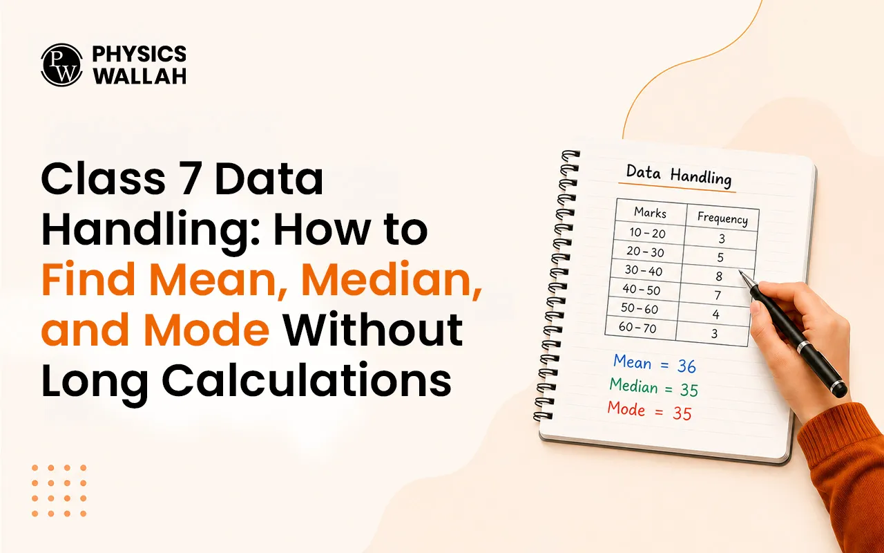
Pictorial Representation of Data: Bar Graph and Double Bar Graph

Bar Graph and Double Bar Graph
Bar Graph and Double Bar Graph are simple tools used for the pictorial representation of data. When we have a large amount of information, it becomes tough to study or compare it just by looking at numbers. That’s where a bar graph helps. It shows data using bars or rectangles, making it easy to see which value is bigger or smaller. This pictorial representation helps us understand information quickly and clearly.
Nowadays, where a lot of data being collected every day, bar graphs and double bar graphs are commonly used in schools, businesses, and research because they make comparison and analysis simple. So, keep reading to learn more about the uses of bar graphs, how to create one, and how double bar graphs help compare two sets of data easily.
Read More: Cartesian Plane
What Is a Bar Graph?
Bar graph is a simple pictorial representation of data using rectangular bars. Each bar shows a piece of information, and the height or length of the bar tells us the value of that data. The bigger the bar, the larger the value it represents. A bar graph helps us compare data easily.
Bar graphs use rectangular bars placed side by side or with small gaps between them. Each bar stands for a different category, like marks scored by students, sales of products, or rainfall in different months. Because it is clear and easy to read, this type of bar graph is generally used in schools, surveys, and reports to make data simple to understand.
Properties of a Bar Graph
A bar graph has some rules that make it clear and easy to read. These are called the properties of a bar graph.
Let's understand some key properties of a bar graph:
-
All bars in a bar graph must have equal width so that the comparison looks fair.
-
Bars can be drawn vertically (up and down) or horizontally (side by side), depending on what looks better for the data.
-
The height or length of each bar shows the value of the data: a taller bar means a bigger value.
-
All bars start from a common baseline, which helps to compare the data correctly.
Read More: Reciprocal
Types of Bar Graphs
There are various types of bar graphs that help us show information in different ways. The three main types of bar graphs are:
Vertical Bar Graph
-
In a vertical bar graph, the bars stand straight, going up and down. The x-axis (horizontal line) shows the categories, and the y-axis (vertical line) shows the values.
-
These graphs are very useful for showing changes over time, like marks scored in different subjects or sales in different months.
-
For example, below is the pictorial representation of data using a vertical bar graph, where the height of each bar shows the number of people who selected a specific hobby as their favorite.

Horizontal Bar Graph
-
In a horizontal bar graph, the bars go sideways from left to right. Here, the categories are written on the y-axis, and the values are shown on the x-axis.
-
This pictorial representation is mostly used when the category names are long or when we want to make the graph look clear and simple.
-
For example, below is the pictorial representation of data using a horizontal bar graph, where each vertical bar shows the number of different kinds of fruits eaten by each student in a week.

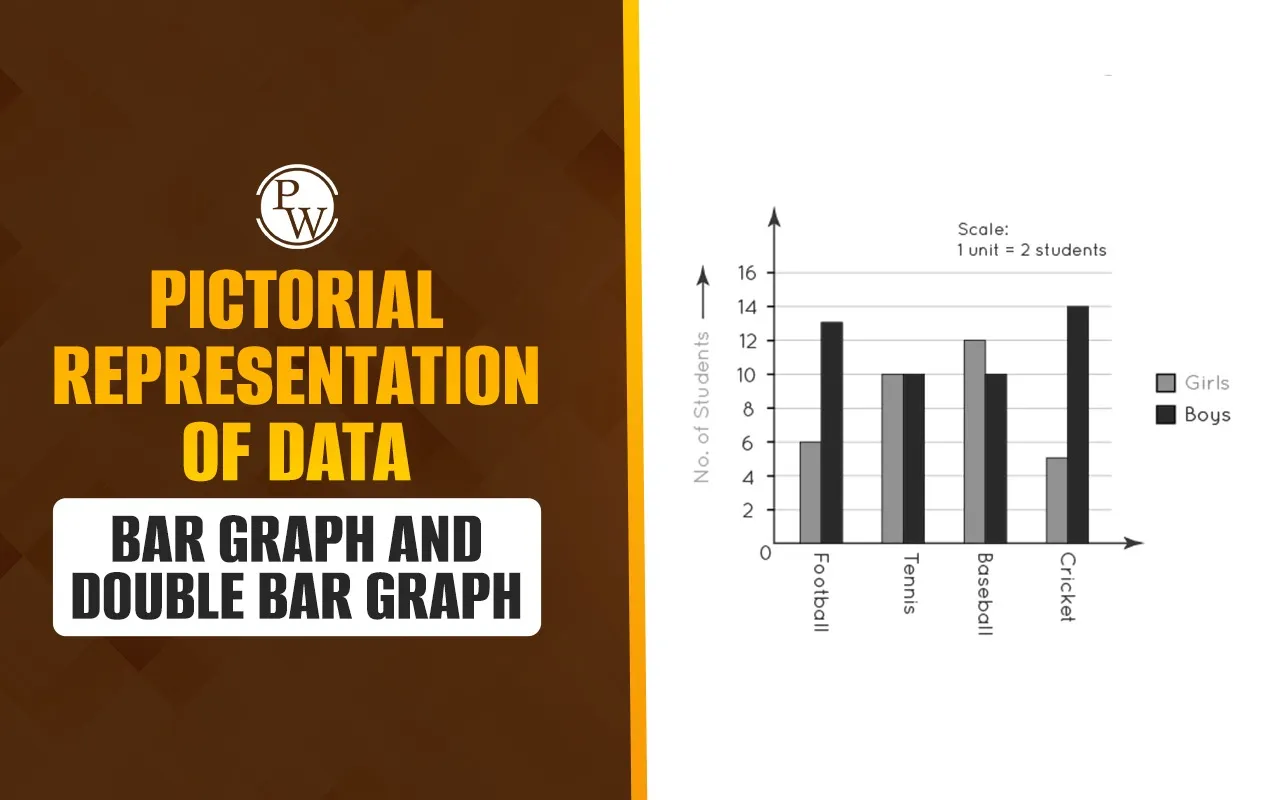
Double Bar Graph
-
A double bar graph is used when we need to compare two sets of data together. It has two bars side by side for each category. These bars can be drawn either vertically or horizontally.
-
For example, below is the pictorial representation of data using a double bar graph, which can be used to compare two groups of data, such as the marks scored by boys and girls in different subjects.

All these types of bar graphs help us show data in a way that is easy to compare, study, and understand.
Read More: Construction in Maths
Creating a Bar Graph
Creating a bar graph is simple if we follow a few easy steps:
-
Step 1: Draw two lines that meet at a corner: one horizontal line (x-axis) and one vertical line (y-axis).
-
Step 2: Arrange the collected data according to the categories and make a table for it.
-
Step 3: Choose a scale to show how much each unit length of the bar will represent. Label both the x-axis and y-axis clearly.
-
Step 4: Draw the bars according to the data and chosen scale. Keep the width of all bars equal and the gaps between them the same.
When we follow these steps for creating a bar graph, the pictorial representation of data becomes easy to read and understand.
Uses of Bar Graphs
A bar graph is used in many places, especially in mathematics, statistics, and everyday life. Here are some common uses of bar graphs:
-
To compare different things, bar graphs make it easy to see which value is bigger or smaller.
-
To show large amounts of data clearly so it is simple to understand.
-
To study patterns, such as growth or decline over time, and make quick guesses about the future.
-
To present information in business, education, and research, helping people make decisions based on clear data.
Because of the many uses of bar graphs, they are a powerful tool for the pictorial representation of data.
Also Read: Numerator and Denominator
Help Your Child Clear Doubts with CuriousJr’s After-School Online Tuition
Do you notice your child getting confused while studying at home or leaving homework unfinished? When children have doubts, learning after school can become hard and stressful.
CuriousJr’s online tuition classes for maths, science, social studies, and English are made to help your child get the right guidance after school.
-
These classes offer clear lessons, doubt-clearing sessions, and personal attention so your child can learn in a simple and stress-free way.
-
With interactive live sessions, regular homework help, and practice sets made for your child’s pace, learning becomes easier and more enjoyable.
-
Parents also get regular updates to track progress and know where extra support is needed.
Give your child the right learning support after school. Book a demo class today and see how CuriousJr’s online tuition makes learning easier and more fun.